80/20 of web accessibility for web apps
Accessibility is not a popular topic in technology, but it’s one of the most important if you want to ensure everyone can use your web app. Our goal with our first accessibility review and improvements was to fix the obvious issues (that are sometimes not that obvious) so that our app is, at the very least, completely functional for all users.
For the base structure of our web app, we use TailwindUI, which is based on the TailwindCSS framework. It’s already built with best practices for user experience and usability in mind. So, our app was already 90% there, but we still found issues that needed fixing.
Researching Web Accessibility
We started with research, and there are a lot of great websites and posts on the topic. Here are three of my favorites:
A first review of web accessibility - W3
W3 is probably the first stop for most people looking at accessibility or other web standards.
We used their First Review of Web Accessibility to run the app through the first checks.
Even though most of these things are very basic, it’s no surprise some things were missed because they’re usually not a priority.
Here are a few highlights from the article:
All images should have alt text. Our app does not have images, and all icons are decorative or have hover notifications, so nothing was needed here.
Correct use of heading tags. This is known to anyone who has ever read something about SEO. But besides SEO, which is irrelevant for our use case in a private web app, headings are also crucial for navigation and hierarchy (make sure they always go from largest to smallest font). We found a minor bug where unnecessary meta text somehow ended up inside heading tags.
Usable dark mode. Some people prefer using dark mode, and some use it at night-time. Browsers now automatically convert websites to dark mode, so you need to review that yours is still readable when dark mode is on. Again, Tailwind does a good job already, so there were only a few minor things to be fixed. You can easily toggle dark mode in the Google Chrome browser by entering “chrome://flags/#enable-force-dark” into the address bar.
The 6 Simplest Web Accessibility Tests Anyone Can Do - Karl Groves
Karl’s best recommendation is to use the keyboard to navigate the website. Can you navigate and use everything without using your mouse?
- Tab: Navigate to links and form controls.
- Shift + Tab: Navigate backward.
- Spacebar: Activate checkboxes and buttons.
- Enter: Activate links and buttons.
- Arrow keys: Radio buttons, select/drop-down menus, sliders, tab panels, auto-complete, tree menus, etc.
- Escape: Dismisses browser dialog or menu.
For our app at the starting state, almost. We did have some issues with edit views and focus (for example, you couldn’t navigate the overlayed edit view because the focus was still in the background).
Two other great recommendations are turning off images and checking that the site is still usable, and improving the usability of field labels (when clicking the label, the cursor automatically goes to the field).
I strongly recommend reading his full post for an excellent overview.
Manual Testing for Accessibility - Harvard University
This is a very good summary of the 80/20 on one short page, and it repeats some of the things from the above two websites (confirming we’re focusing on the critical elements).
Resizing the text in the browser does not break the site. This also caused no issues since mobile access is something we always have in mind, plus Tailwind does a great job out of the box.
Text and background color have a contrast ratio of at least 4.5:1. Everyone knows text should be dark on a light background for best readability. But the contrast requirement does pose some issues for things you’d usually not even notice. In our case, it was archived items. In most interfaces, the archived items are usually greyed out, but this never has the right amount of contrast for readability. So we had to find a different way to visualize archiving, and we still haven’t found a version where everyone is happy (a few options we are looking at: italic font, different font color, different background color).
Ensure color is not used as the only way of conveying meaning or information. The use of color is very beneficial and encouraged, but you want to make sure that nothing of substance is lost if there is none.
Running Tests Using Chrome’s Lighthouse Report
The next step is doing automated tests with the help of Google’s Lighthouse report. This is the same report as on Pagespeed Web Dev, but it’s run inside your browser, so it can be done on websites behind a login.
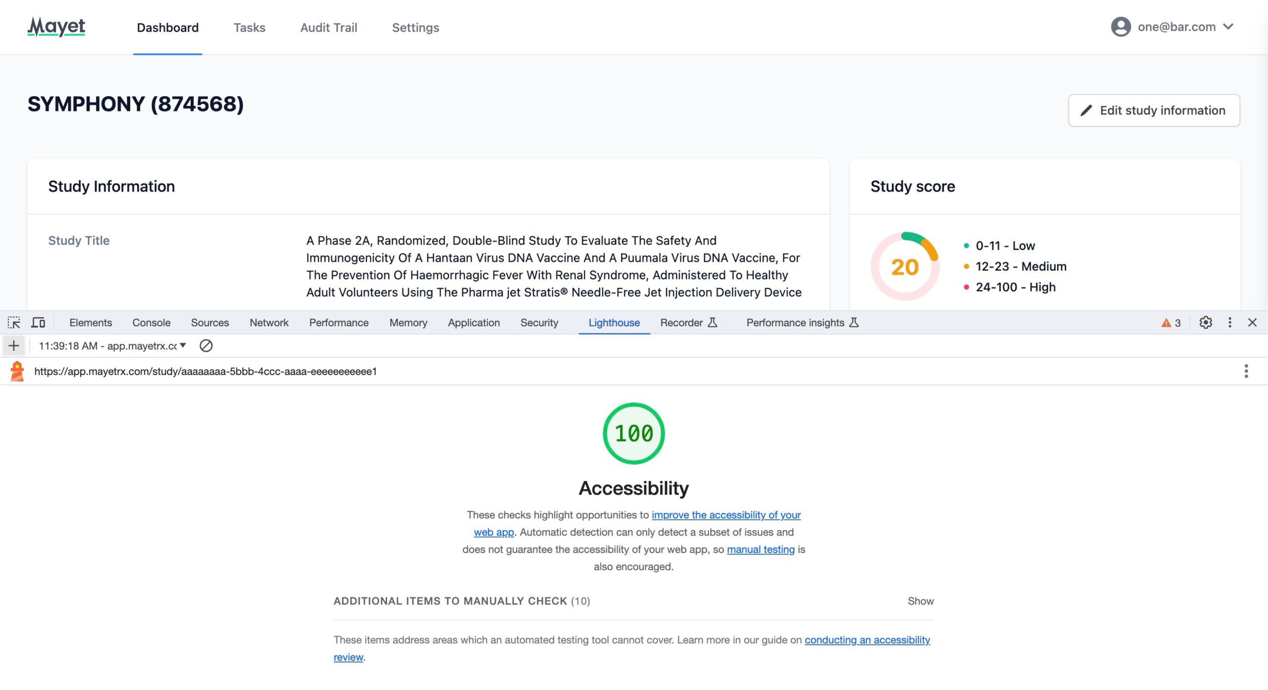
We ran the report on all of the unique pages in the web app and fixed any reported issues. In our case, there were not many, though there were issues raised for contrast, as we expected from the above reading.
Summary
This post should give you a good start at improving your web app’s or website’s accessibility. If you follow the above four steps, you’ll be achieving a lot more than most websites, applications and their designers. In our case, we were initially a bit embarrassed at how poor our previous version’s scores were.
For Mayet, in our journey to refine and enhance our application, we recognised that accessibility is a fundamental aspect of inclusivity and user experience. Our commitment to quality extends beyond the surface, seen in every aspect of our solution.
Our dedication to this is mirrored in our meticulous approach to ensure that every user can seamlessly interact with our solutions. The adjustments and improvements we’ve made, informed by continual research and testing, deliver a solution that meets our clients’ expectations.
About the Author

Dejan Murko
Dejan has previously built over 10 software projects serving more than 10,000 customers before joining Mayet.
Want to discuss vendor oversight?
Book a consultation with Tom Lazenby to explore how Mayet can support your clinical QA needs.